Our homepage is 39 KB, contains no images, and hums at you
Here is the front page of appopolis.app.
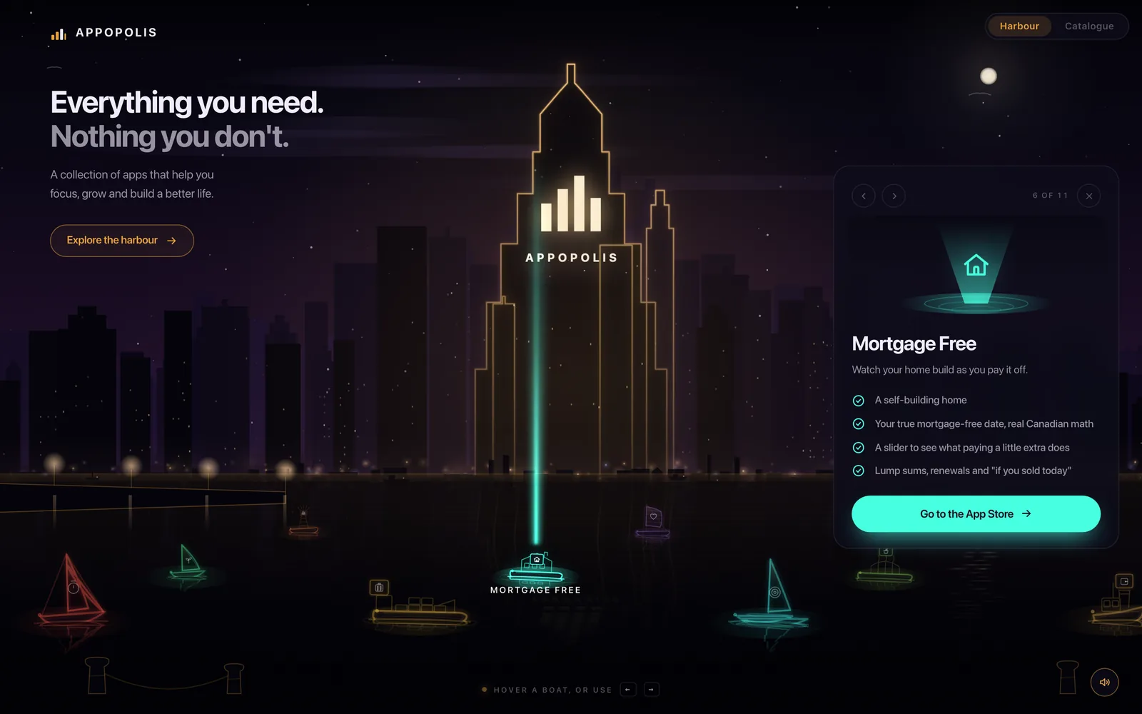
The skyline. The moon. The stars. The eleven boats, one per app. Their reflections wobbling on the water. The lit windows. The little beam connecting the selected boat to the tower.
None of it is an image. There is not a single <img> on that page, not one background-image, not one url() anywhere in the CSS. There is no audio file either, and the page hums — a slow generative drone that answers itself across the harbour.
The whole thing is 39 KB.
I went and measured it rather than trusting the vibes, because this is a blog that has been embarrassed before:
| what | measured |
|---|---|
| HTML over the wire (gzipped) | 40,086 bytes — 39.1 KB |
| Source, uncompressed | 122.8 KB, 2,449 lines |
| Image files downloaded | 0 |
| Audio files downloaded | 0 |
| Everything else on the wire | 0.3 KB (one analytics ping) |
| Crawlable links in the scene | 15 |
And now the part that made me laugh, which you can verify by right-clicking:
The screenshot of the homepage at the top of this post is 53 KB. The homepage itself is 39 KB. A picture of the page is 36% heavier than the page — a compressed, resized picture at that.
Let's take it apart.
1. Neon is a shadow you draw three times
There is no neon in a canvas API. There is no glow, no bloom, no "make this look like a sign outside a bar in 1987" flag. What there is, is shadowBlur — and the recipe is to abuse it.
The trick is two-fold. First, shadowColor and shadowBlur on a stroke throw coloured light outward from the line. Second — and this is the bit people miss — you draw the same shape several times at decreasing blur. A wide, faint pass for the atmosphere. A tighter, brighter pass for the halo. A final pass at shadowBlur = 0 for the hard bright core.
Ours runs 26 → 10 → 0, scaled by device pixel ratio so it doesn't turn to mush on a retina screen.
The other half is globalCompositeOperation = "lighter", which makes overlapping light add instead of paint over. Two glows crossing get brighter where they meet, which is exactly what light does and exactly what "source-over" refuses to do.
Have a go. Drag the blur down to zero and watch a neon sign turn into a diagram:
Glow 0 with one pass is the same path, drawn plainly. Everything that reads as “neon” is in the other two passes.
Notice what happens at one pass: it's a wireframe. The glow is not a filter you apply at the end. It is the drawing, repeated.
2. The soundtrack is a synth, not an MP3
The harbour hums. Slow, low, tidal, with notes that bloom and answer each other.
There is no audio file. It's two oscillators and a burst of filtered noise, assembled in the Web Audio API at runtime. The comment in our source is blunt about why:
Synthesised rather than fetched: two oscillators and a noise burst weigh
nothing, cannot be blocked by a content policy and need no files.
All three of those matter, and the middle one is the sleeper. An audio file is a request, and a request can be blocked, cached wrong, 404'd after a rename, or throttled on a bad connection. An oscillator cannot fail to download.
The thing that makes it sound like a place rather than a beep is a feedback delay: send the note into a delay line, feed a fraction of the output back into its own input, and run the loop through a lowpass so each repeat is duller than the last. Ours: 210 ms delay, 32% feedback, rolled off above 2.4 kHz.
Our source puts it better than I will:
Notes bloom into the harbour and answer themselves instead of stopping dead,
which is most of what separates a synth from a beep.
Here is that exact chain, in this page. Nothing is downloaded — the sound is made when you press the button:
Same note both ways. With the delay off it is a beep; with it on it is a harbour. Sound plays only when you press the button — see §3 for why that is not optional.
Toggle the checkbox and press it again. Same oscillators, same envelope, same note. One of them sounds like a place.
The off switch that wasn't
A war story, because it is a good one.
The mute button used to fade the drone over half a second and stop scheduling new notes. Perfectly sensible. It also did not work, and the reason is sitting in the paragraph above: the delay line had two seconds of tail in it. You pressed mute and the harbour carried on singing to you out of the echo.
Our note on the fix, which I think about more than I expected to:
That is not what an off switch means.
The repair was to route everything — drone, notes, echoes, all of it — through a single master gain, and have the button move that one number. If a mute button has to know about every voice that might be running, it will eventually meet one it doesn't know about. Give it one tap to close instead.
3. Browsers will not let you make noise, and they are right
This is the bit that trips everyone building audio on the web.
An AudioContext created on page load is born suspended. It will not make a sound. Not muted — suspended, its clock stopped, waiting. Every browser does this, and no amount of .play() will talk it round.
The rule exists because a page that makes noise at you unprompted is rude, and the web spent about fifteen years proving it. So the fix is not to fight it — it is to arm the sound and let the reader's first move open the gate:
const WAKE = ["pointerdown", "pointermove", "keydown", "wheel", "touchstart"];
function wake() {
  WAKE.forEach((e) => removeEventListener(e, wake));
  if (!on) return;
  audio();
  if (AC.state === "suspended") AC.resume();
  master.gain.setTargetAtTime(1, AC.currentTime, .25);
}
WAKE.forEach((e) => addEventListener(e, wake, { passive: true }));
pointermove is the important one. A reader who arrives and simply moves the mouse across the page has, as far as the browser is concerned, interacted — and that is the earliest honest moment the harbour can come up. It fades in over a quarter-second rather than snapping on.
And the observation underneath it, which I like a great deal: that first move is also the last moment the sound could still come as a surprise. The policy and the good manners point in the same direction. That is rarer than it sounds.
Also: a tab you walked away from should shut up
Suspend the context on visibilitychange. Two reasons, and the second is subtle:
- Obviously, a page singing in a background tab is the thing everyone hates.
- Less obviously — suspending stops the audio clock, so the melody resumes
where it left off. If you merely stop scheduling notes and come back in ten minutes, everything queued against wall-clock time arrives at once, and your calm ambient harbour greets the returning reader with a chord like a dropped piano.
4. A canvas is a black box, so we hid a real page inside it
Now the part that matters most, and the part that most canvas showpieces get wrong.
To Google, a screen reader, or anything else that reads rather than looks, a <canvas> is one empty element. All that beautiful neon is a bitmap the browser made at runtime. There is nothing to index. There is nothing to announce. A gorgeous canvas homepage with no fallback is, in SEO terms, a blank page with a JavaScript hobby.
So the scene carries a real one underneath it:
<canvas id="sea" role="img"
  aria-label="A neon harbour at night. Each app sails a lit boat across the water."></canvas>

<nav class="fleet" id="fleet" aria-label="Apps">
  <a href="/water-tracker">Water Tracker — Reach your daily water goal, effortlessly.</a>
  <a href="/focus-timer">Focus Timer — Pomodoro sessions that build a city.</a>
  …15 of them, one per boat plus the site's own pages
</nav>
Three things are happening:
role="img"plusaria-labelturns the canvas from an unlabelled mystery
into a described picture. One sentence. It is the alt text for a thing that has no src.
- The
<nav>holds 15 real anchors — every app, plus the catalogue, blog,
support and privacy pages. Crawlers follow them. Screen readers read them.
- The panel that shows an app's details is
aria-live="polite", so when you
arrow between boats, the description is announced instead of silently redrawn.
The links are visually hidden with the standard clip trick — 1px box, clip-path: inset(50%) — never display:none, which would hide them from assistive tech too. That is the whole difference between "invisible" and "absent", and people mix them up constantly.
Here is the good bit. They are hidden until they're focused, and then they become a proper visible pill at the top of the screen. One press of Tab on the live site:
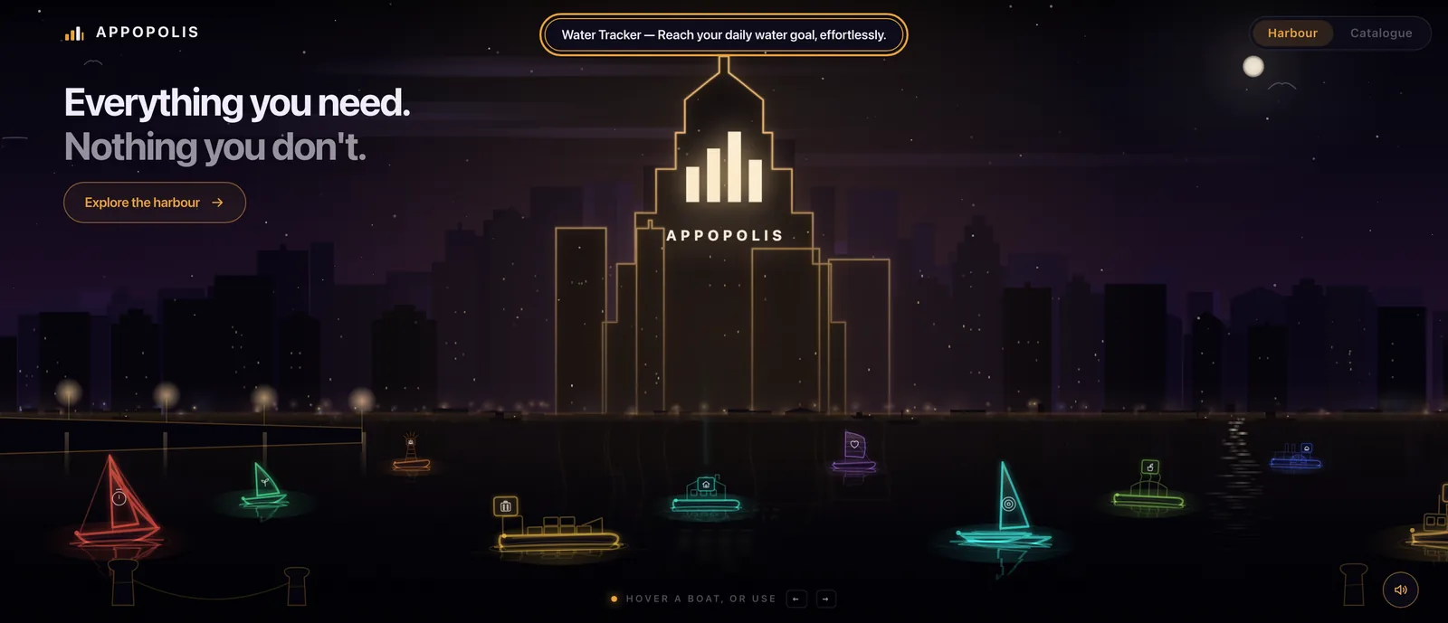
That is a keyboard user's entire route through the harbour, and it costs eleven lines of CSS:
.fleet a {
  position: absolute; width: 1px; height: 1px;
  overflow: hidden; clip-path: inset(50%); white-space: nowrap;
}
.fleet a:focus-visible {
  position: fixed; left: 50%; top: 18px; transform: translateX(-50%);
  width: auto; height: auto; clip-path: none; z-index: 9;
  padding: 9px 16px; border-radius: 999px; background: #0E0C1A;
  border: 1px solid var(--ember); color: var(--ink);
}
If you build a canvas hero and take one thing from this post, take this one. The neon is fun. This is the part that decides whether the page exists.
5. Reduced motion is not just a CSS media query
Most sites handle prefers-reduced-motion with a blanket CSS rule, and we have one too:
@media (prefers-reduced-motion: reduce) {
  * { transition: none !important; animation: none !important; }
}
That rule does nothing to a canvas. Your requestAnimationFrame loop has never heard of it. Every boat still rocks, the parallax still slides, the fireflies still drift, and a reader who asked their operating system for less movement gets the full sea state anyway.
So the JavaScript has to ask too:
const STILL = matchMedia("(prefers-reduced-motion: reduce)").matches;

b.heel = STILL ? 0 : Math.sin(beat * .82 + b.ph) * .045 * b.roll;
if (!STILL) beat += dt;
par.x += ((STILL ? 0 : aim.x) - par.x) * Math.min(1, dt * 2.6);
if (!STILL) stepFlies(dt);
Boats stop heeling. The clock stops advancing. Parallax aims at dead centre instead of the pointer. The fireflies settle. The harbour is still there, still lit, still navigable — it just stops moving, which is exactly what was asked for. Reduced motion means less motion, not fewer features.
Was it worth it?
An honest accounting, because "we drew our homepage by hand in code" is not automatically a good idea.
What it bought. A 39 KB page that renders instantly on any connection, looks sharp at every resolution because nothing is a raster, has no third-party requests, no tracking pixels, no font CDN, no cookie banner, and never shows a half-loaded hero image. It also cannot go stale — the boats come from the same app list as the rest of the site, so a new app sails in on its own.
What it cost. It's 2,449 lines of hand-written page, and a canvas scene is not something a designer can nudge in a visual tool. Every change is code. Nobody else can pick it up in an afternoon.
When it's the wrong call. If your hero is a photograph, buy a photograph. If the scene needs to change weekly, this is a trap. If nobody on the team enjoys writing this kind of thing, the maintenance will quietly stop and it will rot in place, glowing.
We did it because the whole business is small utility apps that do one thing without asking for much — and shipping a homepage that quietly does something impressive on a rounding error of bandwidth is the argument, made in the medium. It would be a bit rich to promise "nothing you don't need" from behind four megabytes of stock imagery and a consent dialog.
The short version
- Neon on canvas =
shadowBlur+shadowColor, the same path stroked 2–3
times at decreasing blur, over globalCompositeOperation = "lighter".
- Synthesise ambient audio instead of shipping it. Oscillators weigh
nothing and cannot fail to download. A feedback delay is most of the difference between a synth and a beep.
- Route all audio through one master gain, or your mute button will one day
meet a voice it doesn't know about.
- An
AudioContextis born suspended. Arm it and let the reader's first
pointer move open it — that is the last honest moment before it's a surprise.
- Suspend on
visibilitychange, or the returning reader gets ten minutes of
queued notes at once.
- A canvas is invisible to crawlers and screen readers.
role="img"+
aria-label, a real hidden <nav> of anchors, and aria-live on whatever updates. Clip it, never display:none.
prefers-reduced-motiondoesn't reach your render loop. Read it in JS and
freeze the motion yourself.
The harbour looks expensive and costs almost nothing, which is the trade we were after. Open it, press Tab, then turn the sound on — in that order. The third one is the only part that needs speakers, and the first two are the parts we are actually proud of.
The boats in that harbour
Focus TimerThe teal one — Pomodoro sessions that build a city On the App Store → Tiny HabitsThe green one, growing a garden one habit at a time On the App Store →Comments
No account needed — pick any name and say your piece.
Nothing here yet. Be the first.